Context
More than property management, a transparent service experience.
In a sector often perceived as bureaucratic and distant, Quorum74 emerges with a clear vision: to transform community management through digital processes and a close, understandable approach for every resident.
Until now, they had no digital presence. They had a basic visual identity —a logo and a name— but needed to build a website from scratch that would convey their values: clarity, trust, and accessible professionalism. All this in a sector where most websites tend to evoke the opposite.
How can I design a website for Quorum74 that shows their fresh approach, builds trust fast, and connects with users who feel frustrated?
Goals
Designing with empathy from the very first click.
The goal was not just to build a modern website, but to create a useful, trustworthy tool aligned with the real needs of users—many of whom arrive frustrated or seeking change.
01.
Understand users' emotional context: identify pain points and expectations through real interviews and surveys.
02.
Convey professionalism and calm: use warm colors, clear hierarchy, and a friendly tone to build trust from the first impression.
03.
Facilitate conversions: make budget requests easy with a smooth, frictionless design and visible CTAs.
04.
Position the brand as a modern alternative: break away from the outdated image of property managers and show a more human, updated approach.
05.
Support current clients effectively: offer fast access to forms, documentation, and useful tools for communities already managed.
06.
Boost SEO and discoverability: optimize performance, structure metadata, and enhance search visibility.
Process
Research and discovery
Everything started with active listening: I met with the Quorum74 team to understand their vision, how they work, and what sets them apart. At the same time, I ran a benchmark of competitor websites and confirmed a common pattern: too much text, legal jargon, outdated pages with neglected user-experience, and navigation that forces visitors to dig for what they need.
The key step came with surveys of real users —owners, community presidents, and current clients. Their answers revealed the main pain points:
Frustation with their current administrator, especially due to lack of attention or problem-solving.
Little clarity or transparency on sector websites, with confusing menus and technical language.
A feeling of distance and coldness—users don’t know who is behind the company or how to reach them directly.

Benckmarking
Strategy and definition – Turning insights into a clear plan
With all the research, it was time to turn the findings into clear decisions.
👥 Who I'm speaking to
Community presidents and board members who make decisions on behalf of residents.
Frustrated property owners looking for change or urgent help.
Sector professionals (lawyers, managers) who might recommend the service.
🧭 What the website needed to be
Clear and straightforward, avoiding legal jargon — explaining what Quorum74 does, how they work, and their experience.
Approachable, with a human, friendly tone of voice.
Guided, helping users quickly find quotes, contact options or key information.
Trustworthy, with visible testimonials, credentials and transparent messaging.
🔧 What I defined
Based on this, I planned key features like:
A streamlined quote request form.
A digital recommendation system.
A help section with FAQs and a keyword search tool.
A clear and accessible legal section.
Private access for communities with explanatory pages.
A calm design that reinforces the brand promise.
This strategic foundation acted as a compass for the rest of the project — aligning every decision with real user needs and Quorum74’s mission: to manage communities in a modern, people-first way.
Site architecture and wireframing– Turning insights into intuitive structure
To guide users with minimal friction, I designed a content hierarchy based on three simple questions:
Who are you? — What do you need? — How can we help you?
This logic led to a clear, decision-oriented sitemap, which we translated into functional wireframes to validate the structure before moving into visual design.

Sitemap
The homepage was built with a direct focus on action — requesting a quote or getting in touch — without overwhelming users with long texts. We also included quick access links to key sections like legal FAQs, blog updates, and a direct link to the newsletter, ensuring important information is always one click away.
This groundwork with wireframes and content planning ensured that every part of the site addresses a specific user need, clearly and effectively.

Wireframes of the landing page
UI and Visual Design – Shaping clarity and calm
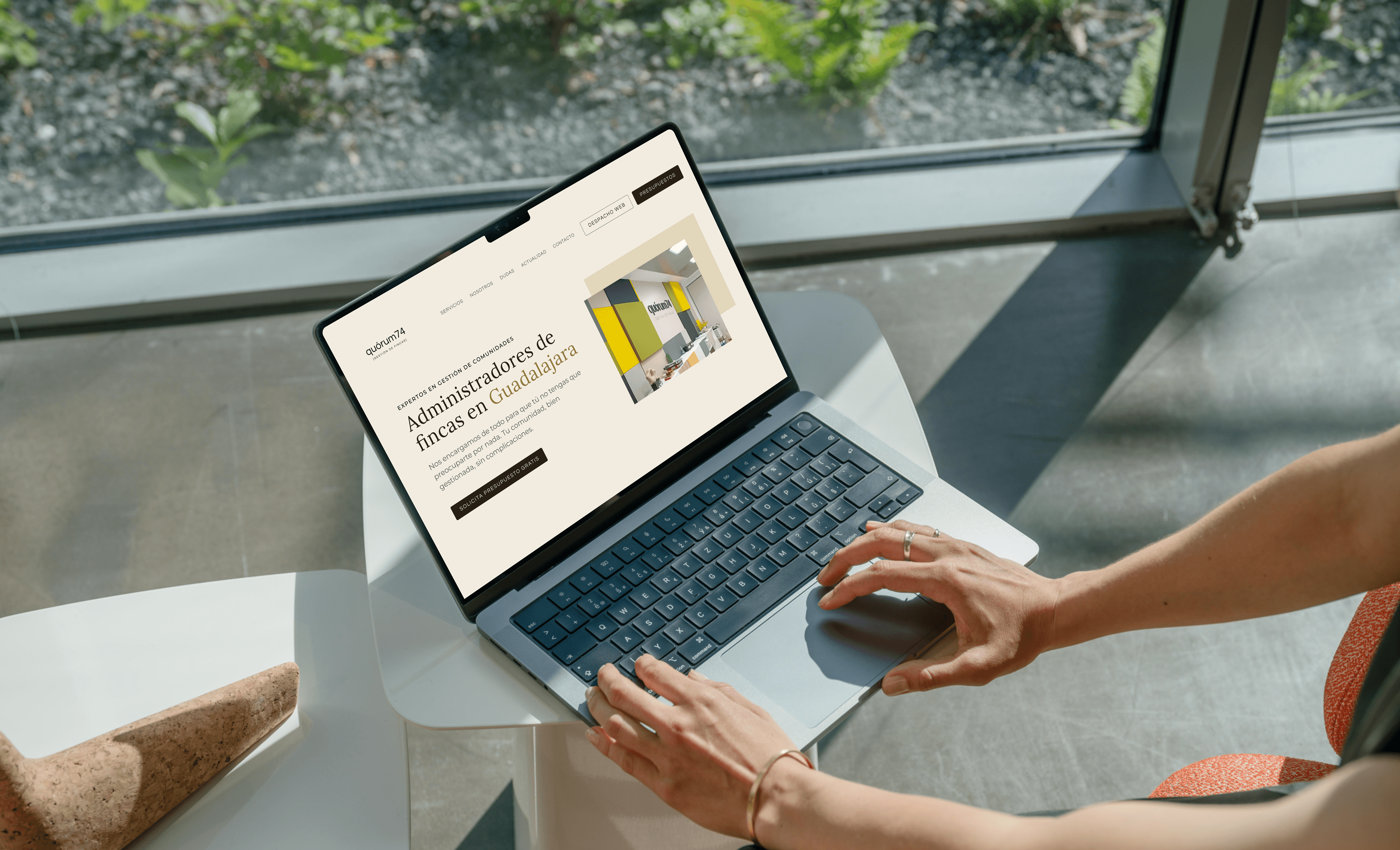
After, I moved on to developing a high-fidelity, interactive prototype in Figma, ensuring the design was both visually appealing and functionally effective.
🎨 A color palette to build trust
To create a feeling of calm, warmth, and professionalism, I used a palette of soft neutral tones —sand, stone, beige— that help users feel at ease from the first moment. Dark mustard and brown accents were added in buttons, icons, and calls to action to gently guide attention without being aggressive.
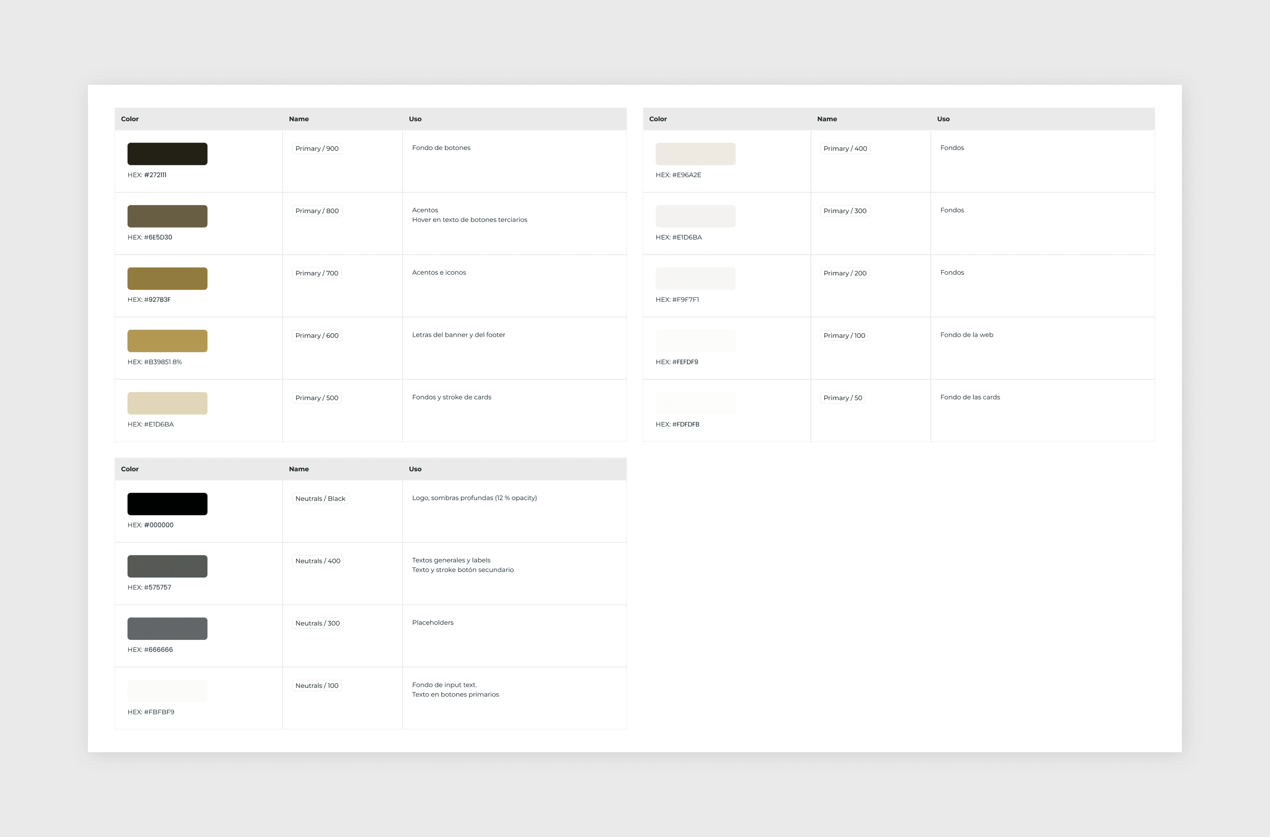
Design decisions
✏️ Typography with purpose
I combined Montserrat (a clean sans serif) and Lora (a friendly serif) to balance readability, structure, and warmth. Montserrat gives clarity to titles and navigation, while Lora adds a human touch to longer texts. This typographic hierarchy helps create a smooth reading experience on all screen sizes.
🧩 Prototyping in Figma
The full design was created in Figma, including a high-fidelity prototype and a system of reusable components and shared styles. This made it easier to test and validate ideas early, and kept everything consistent during development.
🧠 UX Writing & microcopy
I wrote every piece of text in a natural and human tone, avoiding legal jargon and being clear about what each action meant. Instead of aggressive messages, we used calm and friendly CTAs. The content is designed to guide the user and build trust along the way.
📱 Accessibility considerations

Hight fidelity design - Figma
📱 Responsive and component-based approach
Build and customization – From design to finished product
The site was built on WordPress with Elementor Pro, but every page was designed from scratch to keep visual consistency and match Quorum74’s brand.
🔒 Key plugins
Complianz – cookie management and GDPR compliance.
WP Forms – fast contact and quote forms.
Wordfence – extra security and firewall.
🧩 Custom code
I added custom CSS and JavaScript to keep a consistent UI on every device, to build a live FAQ search that highlights the right answers, and to create an image-driven slider that automatically highlights the matching text block as each slide appears—so visuals and content always stay in sync.


🚀 Speed and SEO
Google Fonts are hosted locally to load pages faster and reduce external requests. On the SEO front, I focused on optimizing meta titles, descriptions, and alt text to improve search engine rankings while also enhancing site performance by optimizing images and refining heading structures (semantic HTML structures) for better accessibility and indexing.
Results
Results and follow-up – A living website that keeps growing
After the launch, the Quorum74 website started working as a real tool for communication and new client leads. Visitors can now easily ask for a quote and find answers to common questions thanks to the content strategy.
The work didn’t stop after going live. We set up a plan for regular updates, focused on:
Checking user data through Google Analytics.
Testing key user journey steps, like contact forms.
Improving page speed and technical SEO.
The custom design and flexible structure allow the website to grow as the company evolves — adding new services, team members or tools when needed.
You can explore the final website at quorum74.com.
Learning
There was room for improvement
The work doesn’t stop at launch. Using Google Analytics I will continuously analyze engagement metrics to identify opportunities for further optimization.
Additionally, the website will continue to evolve with new features and improvements, ensuring it remains aligned with user needs and business goals.
Working on Quorum74 was more than just creating a website. It was about understanding real user needs, solving pain points, and building a digital space that feels calm, helpful, and human.
This project mixed strategy, UX/UI design, custom code and a deep care for detail — always with one goal: making life easier for communities and the people who manage them.
💛 As a freelance designer, it’s been a chance to grow, learn, and enjoy the full creative process from idea to launch. 💛
